I thought it would be illustrative to take a look at the recent price charts for the S&P 500 sectors. Here I use the Select Spider ETF's to represent the S&P 500 sectors, both on an absolute and relative to the S&P 500.
Consumer Discretionary
At this juncture, the discretionary sector looks to be in a consolidation phase. This follows absolute and relative gains since August. However, downside volume appears to be picking up, and I could possibly get negative on the sector if the index break the 50-day moving average. This is while other measures (like the MACD) continue to decline.


Consumer Staples
The staples group has been in an uptrend for more than a year on an absolute basis. Relative to the S&P 500, staples stocks performance has been choppy. At this point, the trend(s) appears to remain intact. The sector broke the 50-day moving average, but volume on the downside is muted. The relative performance will likely be dictated by how the broader, more cyclical areas of the market perform.

 Energy
The performance of the energy group had been improving since July through September. This corresponds with the increase in the price of oil, noting that the energy sector is dominated by large oil concerns. In my opinion, the performance of the XLE will largely be predicated on the path of price oil, which I believe is still pointing down, offset somewhat by what appears to be the firming in natural gas and other other energy commodities. Using the United States Oil Fund (ticker USO) as a proxy for a price of oil, I think that oil is likely to trade into the June/July lows.


Financials
On a relative basis, the financial sector is gaining strength, noting the positive RSI and MACD. I do have some concern that the RSI and the price (absolute and relative) trends are showing some divergence. At this juncture however, I would surmise that any pullback in the sector would represent a buying opportunity.


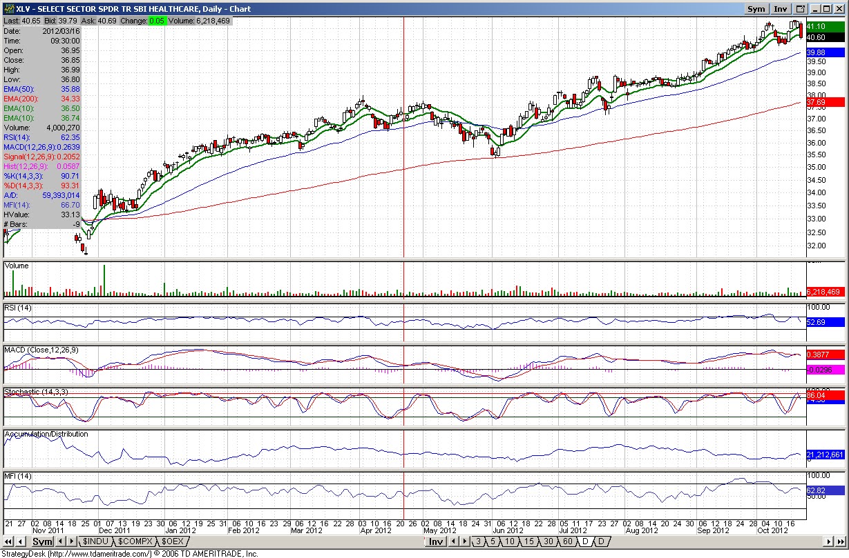
Health Care
The health care sector has been in a strong uptrend on both an absolute and relative basis. The sector may be prone to a pullback, considering that the group is overbought on the stochastics while the RSI/MACD round out, but unless there is a pick up in volume a decline could represent a buying opportunity.


Industrials
Industrials appear to be taking it on the chin on a relative basis. In addition, the 50-day moving average appears to be overhead resistance on the relative chart. This likely reflects the slow global manufacturing environment. The MACD on the absolute price chart appears to be heading negative, suggesting continued weakness.


Materials
Strangely enough and despite the weakness in industrials, the materials group is showing recent resilience. On a relative basis, the price of materials look to be trying to improve off the base, albeit still in a donwtrend and still contained by the 200-day moving average. The RSI and MACD on the relative chart are improving.


Technology
Technology shares really took it on the chin with disappointing results from Google, IBM, and other technology companies. Looking at the price chart for the technology sector, volume has been picking up to the downside while the MACD and RSI have turned decidedly negative. A test of the 200-day moving average is most definitely in the cards. The relative price chart has broken all supports line and the next stop could very well be the later 2011/early 2012 bottom.


Telecom
As there is no Spider telecom sector ETF, I substitute the Vanguard World Telecom ETF, ticker symbol VOX. The volume signals on the VOX are a little unclear, as the ETF typically trades in the range of 10,000 to 35,000 shares daily. That said, the MACD has turned negative and the RSI is weakening. This is occurring in conjunction with some high volume declines. The relative price chart remains in an uptrend.


Utilities
The utility sector ETF remains off its August 2012 highs, which was signaled by a higher volume decline of the top. The sector is technically overbought on the stochastic, but the MACD looks like its is trying to firm up. As for the relative price chart, the XLU may be attempting to consolidate following the decline of the highs.


Consumer Discretionary
At this juncture, the discretionary sector looks to be in a consolidation phase. This follows absolute and relative gains since August. However, downside volume appears to be picking up, and I could possibly get negative on the sector if the index break the 50-day moving average. This is while other measures (like the MACD) continue to decline.


Consumer Staples
The staples group has been in an uptrend for more than a year on an absolute basis. Relative to the S&P 500, staples stocks performance has been choppy. At this point, the trend(s) appears to remain intact. The sector broke the 50-day moving average, but volume on the downside is muted. The relative performance will likely be dictated by how the broader, more cyclical areas of the market perform.


The performance of the energy group had been improving since July through September. This corresponds with the increase in the price of oil, noting that the energy sector is dominated by large oil concerns. In my opinion, the performance of the XLE will largely be predicated on the path of price oil, which I believe is still pointing down, offset somewhat by what appears to be the firming in natural gas and other other energy commodities. Using the United States Oil Fund (ticker USO) as a proxy for a price of oil, I think that oil is likely to trade into the June/July lows.


Financials
On a relative basis, the financial sector is gaining strength, noting the positive RSI and MACD. I do have some concern that the RSI and the price (absolute and relative) trends are showing some divergence. At this juncture however, I would surmise that any pullback in the sector would represent a buying opportunity.


Health Care
The health care sector has been in a strong uptrend on both an absolute and relative basis. The sector may be prone to a pullback, considering that the group is overbought on the stochastics while the RSI/MACD round out, but unless there is a pick up in volume a decline could represent a buying opportunity.

Industrials
Industrials appear to be taking it on the chin on a relative basis. In addition, the 50-day moving average appears to be overhead resistance on the relative chart. This likely reflects the slow global manufacturing environment. The MACD on the absolute price chart appears to be heading negative, suggesting continued weakness.


Materials
Strangely enough and despite the weakness in industrials, the materials group is showing recent resilience. On a relative basis, the price of materials look to be trying to improve off the base, albeit still in a donwtrend and still contained by the 200-day moving average. The RSI and MACD on the relative chart are improving.


Technology
Technology shares really took it on the chin with disappointing results from Google, IBM, and other technology companies. Looking at the price chart for the technology sector, volume has been picking up to the downside while the MACD and RSI have turned decidedly negative. A test of the 200-day moving average is most definitely in the cards. The relative price chart has broken all supports line and the next stop could very well be the later 2011/early 2012 bottom.


Telecom
As there is no Spider telecom sector ETF, I substitute the Vanguard World Telecom ETF, ticker symbol VOX. The volume signals on the VOX are a little unclear, as the ETF typically trades in the range of 10,000 to 35,000 shares daily. That said, the MACD has turned negative and the RSI is weakening. This is occurring in conjunction with some high volume declines. The relative price chart remains in an uptrend.


Utilities
The utility sector ETF remains off its August 2012 highs, which was signaled by a higher volume decline of the top. The sector is technically overbought on the stochastic, but the MACD looks like its is trying to firm up. As for the relative price chart, the XLU may be attempting to consolidate following the decline of the highs.


No comments:
Post a Comment