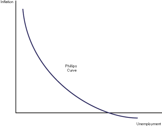
In case you have not seen it, and if you do not read his weekly pieces you are truly doing yourself a disservice, Hussman takes generally accepted economic concepts exposed by central bankers, politicians, and investment professionals alike. The entire piece can be found here, but I provide you an excerpt. Just tell yourself that central bankers are following the right path after reading the excerpt below.


The Phillips Curve
Consider first the notion of the
“inflation-unemployment tradeoff” – the so-called Phillips Curve. Part
of the reason that investors fall for this idea so easily is that many
of them learned it from a nicely drawn diagram in some economics
textbook. Like the one below. The idea is that as the unemployment rate
rises, inflation falls, and as unemployment falls, inflation rises.
The belief in this tradeoff has become so dogmatic that economists
often comment about how we might intentionally target a higher rate of
inflation in order to bring the unemployment rate down. Nice, clean
diagrams lend themselves to such simplistic and dogmatic thinking.

Below is what the actual data look like, depending on exactly how the proposed relationship is stated.
The first chart shows the relationship between the
unemployment rate and the most recent year-over-year inflation rate.
The relationship isn’t even downward sloping, but more importantly,
it’s extraordinarily noisy. The clean curves presented in textbooks are
so much more convenient.

The next chart is what people have in mind when
they think of low unemployment causing inflation, and high unemployment
as causing deflation. The chart shows the unemployment rate versus the
CPI inflation rate one year later. Again, the relationship slopes the
wrong way, but is in any case an insignificant relationship lost in a
cloud of noise.

Of course, one might argue that the Phillips curve is best stated as a relationship between the unemployment rate and the change
in the inflation rate over the following year. This one at least gets
the sign of the relationship right, but that relationship is again
insignificant relative to the surrounding noise.

The next chart is what people have in mind when
they think of reducing unemployment by allowing higher inflation. It
shows the relationship between the CPI inflation rate, and the
unemployment rate in the following year. If one believes that
raising inflation is a way of lowering unemployment, the data is
completely unsupportive. In the real world, inflationary periods often
feature economic and speculative imbalances that are followed by
recession and higher unemployment.

Without torturing every permutation of this
relationship, suffice it to say that the foregoing clouds of noise and
weak relationships show up in every other statement of the
inflation-unemployment tradeoff, regardless of whether one uses levels,
changes, trailing data, subsequent data, CPI inflation, core
inflation, or mixtures of all of these.
What’s perplexing about this entire
inflation-unemployment argument is that the original “Phillips Curve”
proposed by A.W. Phillips in 1958 was a relationship between
unemployment and wage inflation, based on century of data where
Britain was on the gold standard and general price inflation was
virtually non-existent. So the Phillips curve is actually a
relationship between unemployment and real wage inflation.
The resulting relationship can be stated very simply: wages
rise, relative to other prices, when unemployment is low and labor is
scarce; wages fall, relative to other prices, when unemployment is high
and labor is abundant. The chart below nicely illustrates this relationship in U.S. data. It relates current unemployment to subsequent real wage inflation.

Unfortunately, even the true Phillips
curve is emphatically not a relationship that can be manipulated to
create jobs or lower the unemployment rate. The natural response of
policy-makers and economists has been to ignore Phillips’ original
formulation and torture the data instead. This torture usually takes
the form of an “expectations augmented” Phillips Curve. This is the
notion that various levels of inflation get built into expectations,
causing the Phillips Curve to shift up and down over time, but
retaining a “short-run” tradeoff that can be manipulated.
The concept of a “natural rate of unemployment” is
closely related – the basic idea is that the Phillips Curve shifts up
and down over time, but can still be manipulated by clever policy
makers with compassion and vision. The red lines give some idea of the
proposed torture to the data.

Even these short-run “Phillips Curves” are
overwhelmed by noise unless one draws so many that every few
consecutive points represent a separate little Phillips Curve – and
half of them would slope the wrong way. When one compares this mess
with the true Phillips Curve – an unambiguous relationship between unemployment and real wage
inflation, it’s evident that these alternate formulations are an
effort to bend the evidence to support an interventionist dogma.
No comments:
Post a Comment